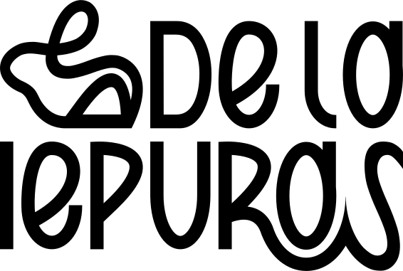
De la Iepuraș logo
Branding

Branding for De la Iepuraș

A warm, nostalgic identity for a sweets and pastry brand from Chișinău, built around one promise: remember the taste of childhood.

Client
De la Iepuraș
Industry
Sweets & pastry
Year
2025
  • Naming
  • Brand Identity
  • Brand Book
  • Print Design
  • Illustration
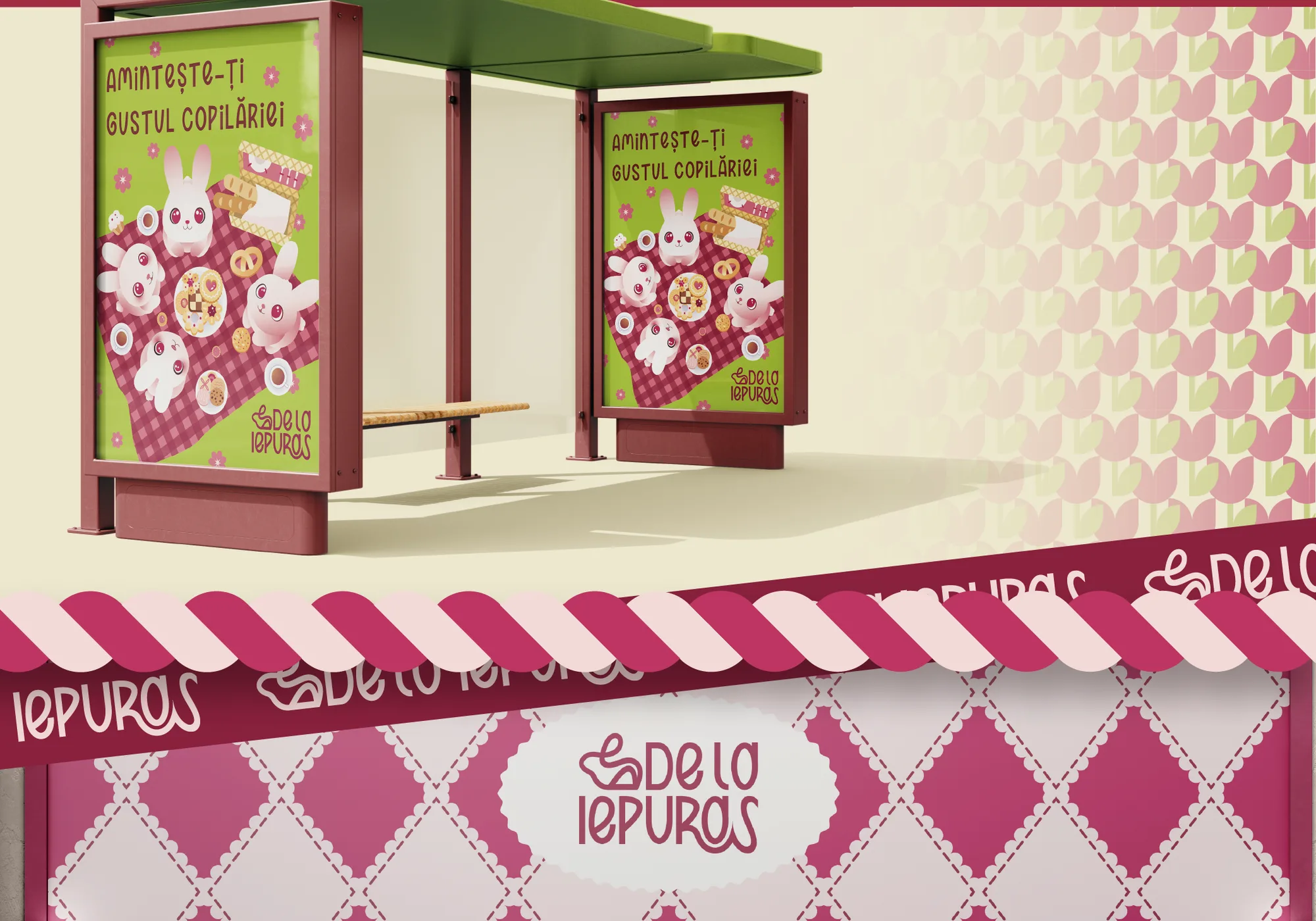
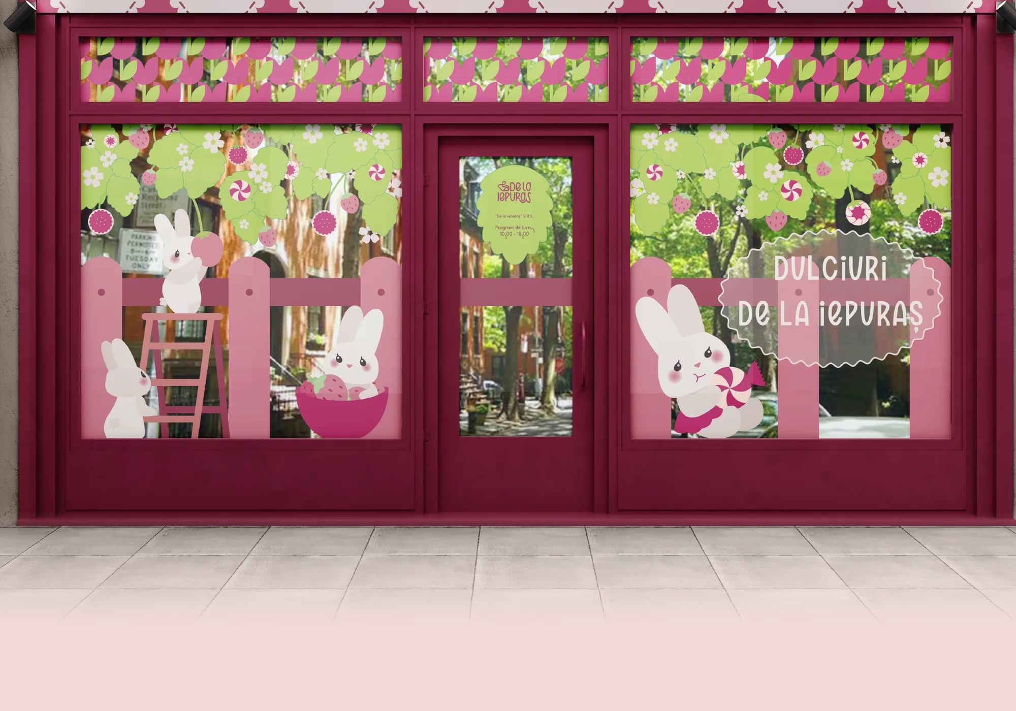
De la Iepuraș — 1De la Iepuraș — 2De la Iepuraș — 3De la Iepuraș — 4De la Iepuraș — 5De la Iepuraș — 6De la Iepuraș — 7

Outcomes

  • We created the name De la Iepuraș: memorable, friendly and instantly tied to childhood for its audience.
  • We built a warm identity that brings back the taste of childhood.
  • We drew a bunny mark and five original patterns that make the brand recognisable at a glance.
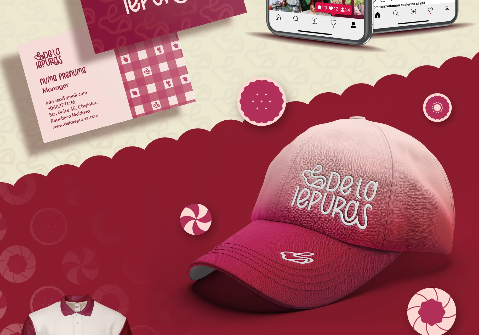
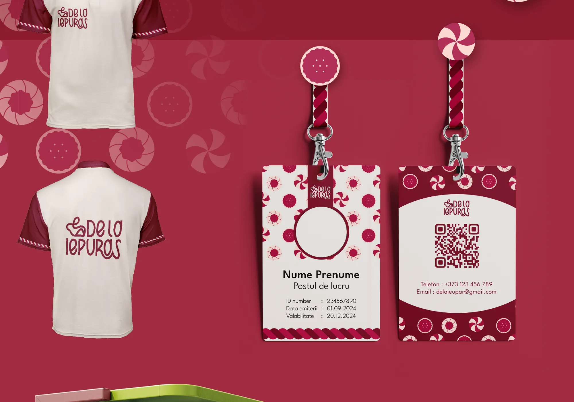
  • We applied the identity to stationery, staff uniforms and the delivery van fleet, ready for production.
  • We collected every rule in one brand book, so printers and suppliers apply it the same way every time.
Brief

De la Iepuraș makes sweets and pastries in Chișinău. They needed a complete visual identity and brand book: a warm, friendly image that stands out on the shelf and stays consistent on every physical and digital touchpoint, all carrying their core message, “Remember the taste of childhood.”

Thinking

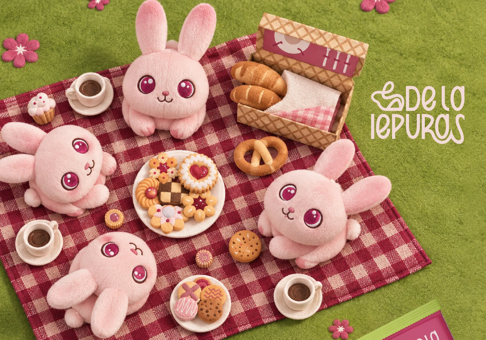
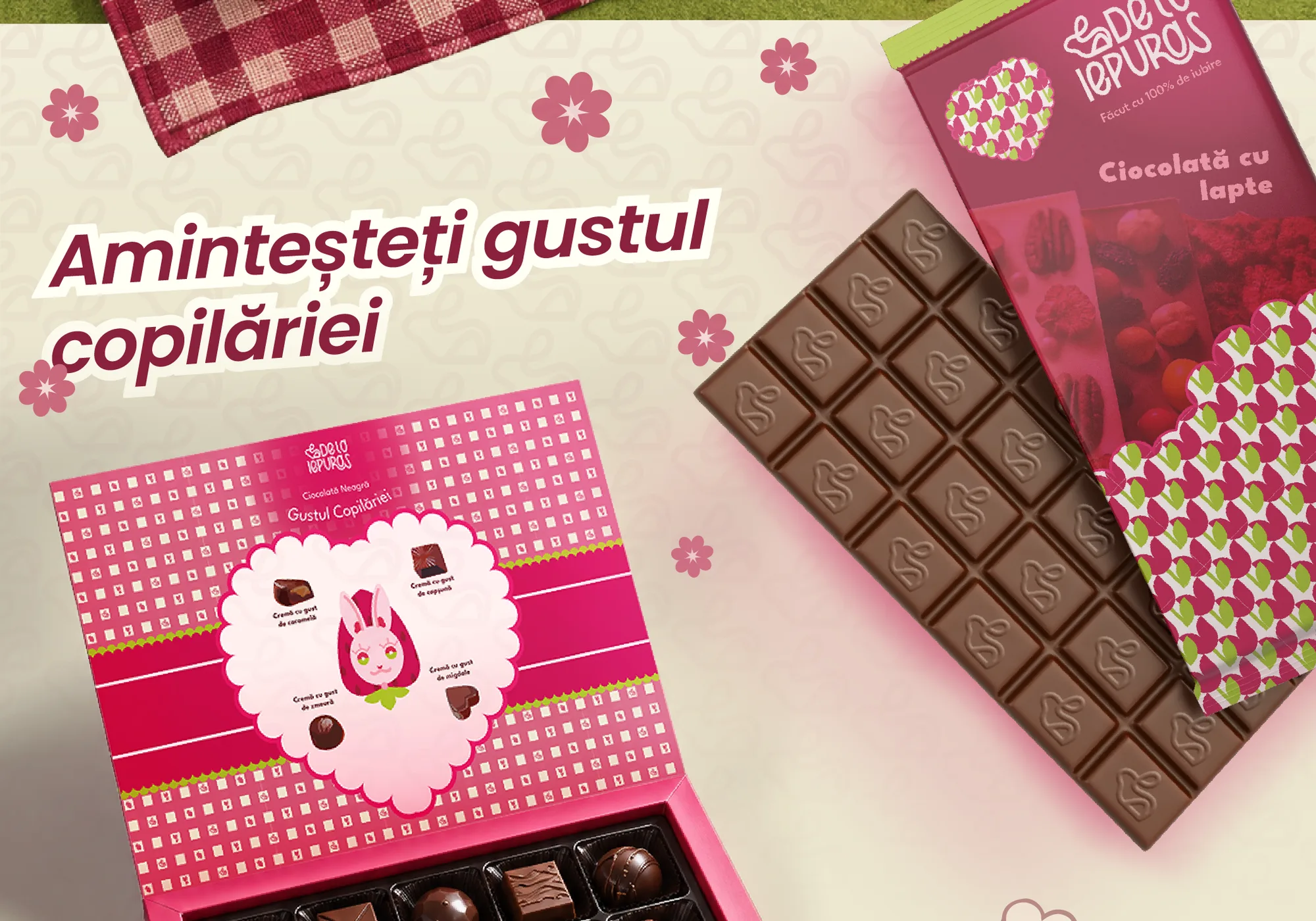
We blended two styles that complete each other. The rustic side brings tradition and naturalness: gingham picnic checks, lace details and botanical elements like leaves, tulips and forest fruits. The playful kawaii side makes it modern: a round, expressive bunny character and stylised biscuit illustrations.

Strategy

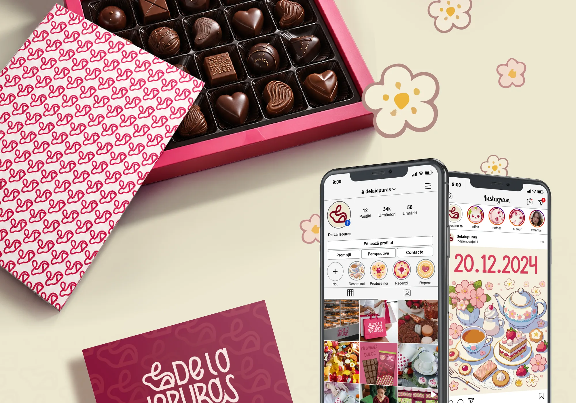
The logo pairs a single continuous line drawing of the bunny with custom, playful lettering, so it is easy to recognise at any size. Every rule went into the brand book, so printers and production suppliers can apply the brand correctly without guessing.

System

A palette taken from the kitchen and the garden: raspberry and cherry reds (#BC1449, #AD103C, #7C0A22), a fresh botanical green (#A0B626), vanilla cream and powder pink backgrounds (#F2EBE3, #F5D8D4) and chocolate brown (#2D0A0A) for text. Gafeko Cute Font for the logo and short headlines, League Spartan for everything else.

Five original patterns (picnic checks, lace diamonds, florals, biscuits and the bunny monogram) plus detailed themed illustrations for packaging, campaigns and shop interiors.

Touchpoints

  • Naming
  • Logo & bunny mark
  • Colour palette
  • Typography
  • 5 patterns
  • Illustrations
  • Stationery
  • Staff uniforms
  • Vehicle wrap
  • Brand book
Next projectGolden Vanilla

Next step

Ready to build your brand?

Tell us about your business in a short form. We'll book a free call and send you a personal quote—no obligation.

Get a free quote