Elevation in Leadership teaches courses that help leaders improve their skill set. They needed a brand that feels ambitious, modern and confident: something that stands out from the usual corporate look of training programs and makes leaders want to sign up.
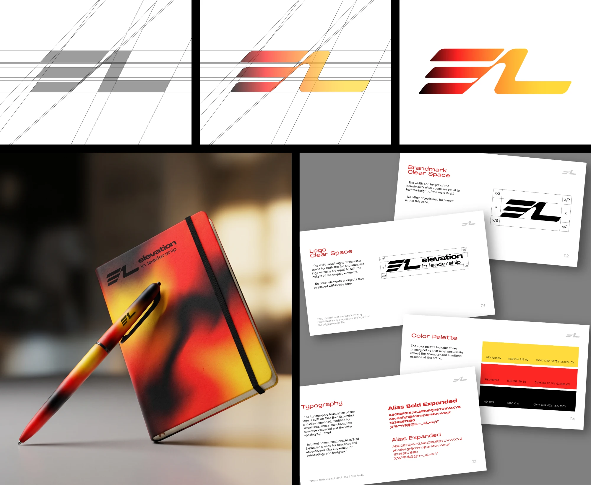
Elevation is movement upward. We turned that into the core idea: an E and an L that lean forward and rise, with a colour gradient that moves from deep black through red to bright yellow, like energy building up.
We built the mark on a precise construction grid, so it feels engineered and dependable, then gave it warmth and energy through colour. Wide, expanded typography adds confidence and speed, and every rule is documented so the brand stays consistent wherever it appears.