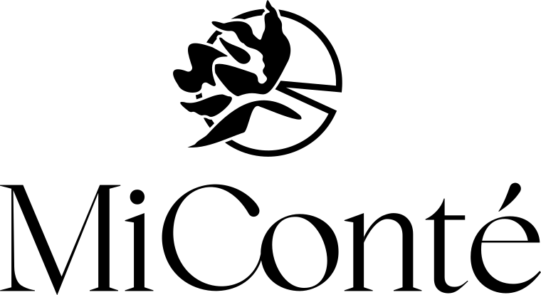
MiConté logo
Branding

Branding for MiConté Gourmet Cakes

A premium boutique identity for an artisan cake studio in Chișinău. A lotus that doubles as a sliced cake, deep plum and champagne gold lift a one-woman business to the level of the big pastry houses.

Client
MiConté
Industry
Artisan cake boutique
Year
2026
  • Brand Strategy
  • Brand Identity
  • Packaging
  • Print Design
  • Brand Book
MiConté — 1MiConté — 2MiConté — 3

Outcomes

  • We positioned a one-woman cake studio as a premium boutique brand.
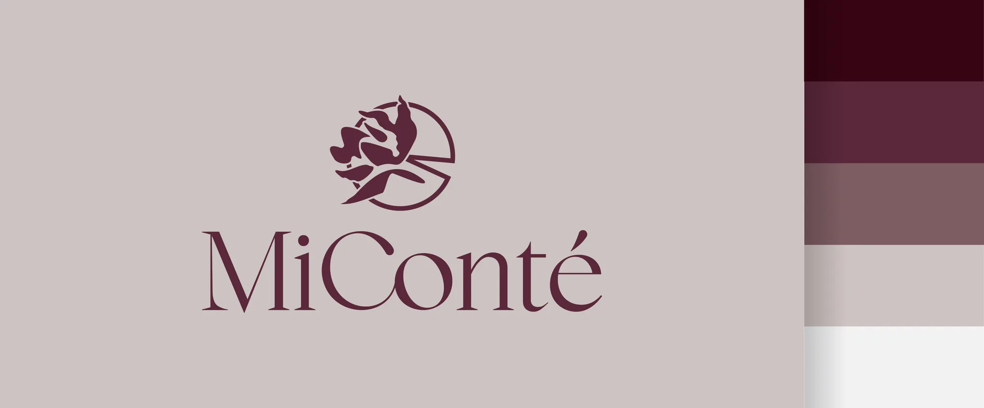
  • We found a symbol no competitor uses: a lotus that is also a sliced cake.
  • We drew a custom wordmark instead of using a ready-made font.
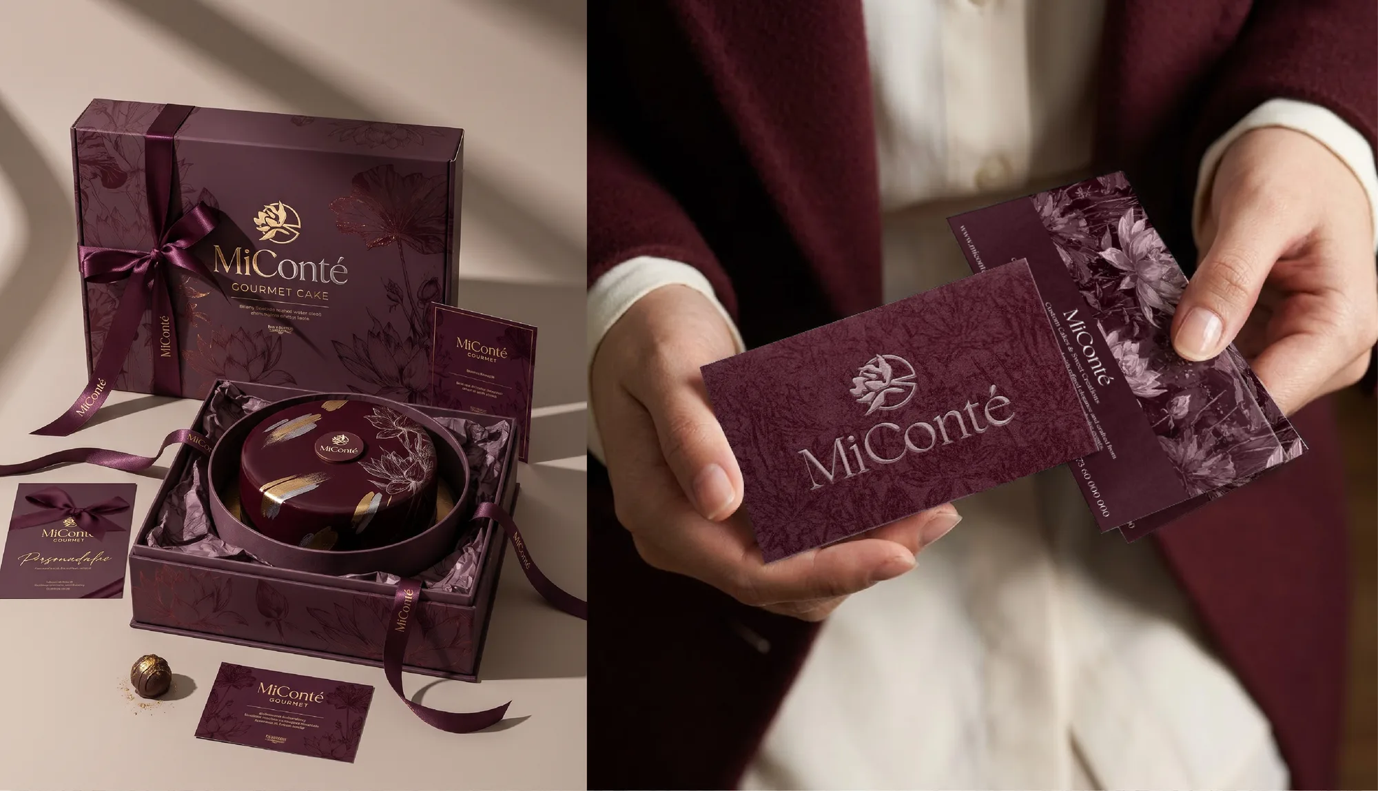
  • We designed packaging and soft-touch cards that turn every order into an unboxing ritual.
  • We set a visual and verbal tone ready for print and social media.
Brief

MiConté makes small and medium custom cakes to order and individual gourmet desserts in Chișinău. The founder runs it on her own, but from day one she aimed for the premium-luxury segment. She asked for an identity built from scratch: deep, elegant and refined, starting from the motif of a flower. The challenge was making a one-person business read as an exclusive boutique experience, not a “homemade product”: one that justifies a fair price, earns full trust in the ingredients and connects emotionally from the first look and touch.

Thinking

Instead of the rose or peony everyone in confectionery uses, we researched floral symbolism and chose the lotus. It stands for purity, unaltered quality and noble elegance, exactly what the founder puts into her ingredients and craft. And seen from above, the lotus with its round leaf and natural slice-shaped notch looks strikingly like a cake with one portion cut out. The product lives inside the symbol, with none of the industry clichés: no whisks, chef hats or cupcakes.

Strategy

We audited the local competition and found the unclaimed territory: moving from the rustic, homemade look to luxury boutique. A bold, sensory palette takes the brand out of childish pastels and anchors it in fine evening desserts, noble chocolate and luxury gifts. The tone of voice is sophisticated but warm and appetising, ready for print and social media.

System

A custom wordmark, built by merging and reshaping several serif families: we adjusted curves, contrast and letter endings to balance classic editorial style with a modern, airy feel. A palette of deep plum burgundy with champagne gold foil accents and cream ivory for contrast and legibility.

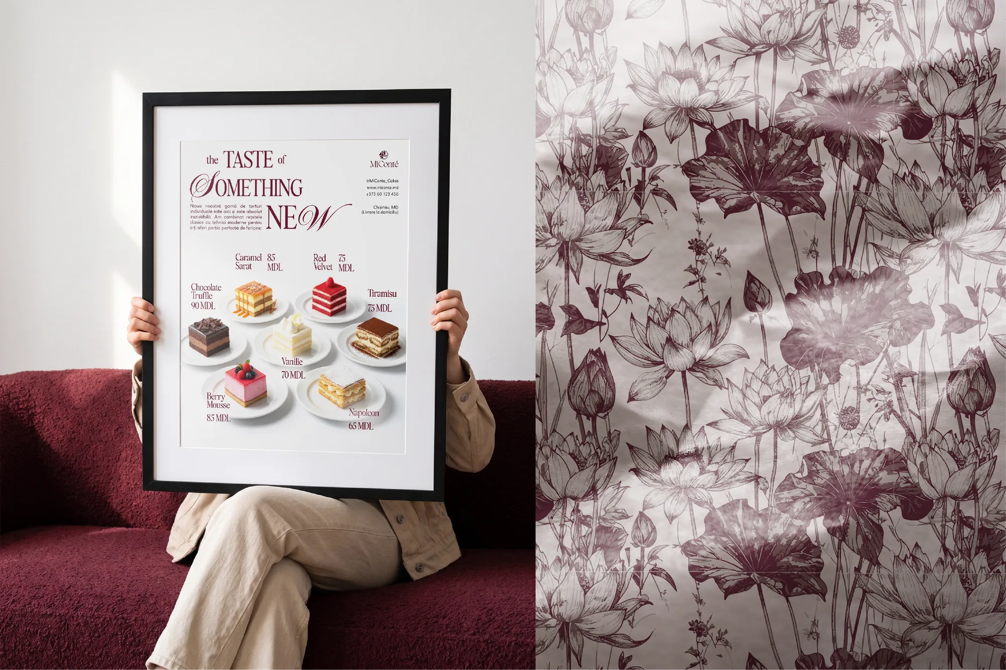
Packaging designed as a stage: boxes sized for small and medium cakes, fine tone-on-tone botanical illustrations, gold foil, custom satin ribbons and cards for personal messages, so opening the box becomes a ritual. Soft-touch business cards with subtly embossed botanicals echo the velvety feel of the creams and glazes. Editorial, magazine-style posters and menus pair clean product photography with expressive type: “The Taste of Something New”.

Touchpoints

  • Market audit
  • Lotus concept
  • Custom wordmark
  • Colour palette
  • Cake boxes
  • Satin ribbons
  • Thank-you cards
  • Soft-touch business cards
  • Posters & menus
  • Price list templates
Next projectBranding for De la Iepuraș

Next step

Ready to build your brand?

Tell us about your business in a short form. We'll book a free call and send you a personal quote—no obligation.

Get a free quote